
Author: Amaad Zaidi
Mentor: Dr. Kyle Keane
The Aga Khan Academy
Introduction
Our Investigation
We, humans, have innovated massively since the last century. This ‘innovation’ can be seen all around us in everyday machines like computers, mobile phones, and even vehicles. However, we had to make many sacrifices without even knowing it to reach where we are currently. Our massive urge to develop at such a rapid rate blinded us. We were not able to notice how much we have taken away from our planet, from ourselves. The more we develop at this abnormal rate, the more resources and land we take away from ourselves and other living things like wildlife.
India, a country that innovated immensely since its independence in 1947, faces this issue today. To accommodate the needs of the increased population of more than a billion people, areas that once had tree cover and many forest areas have suffered massive deforestation. Sure, comparing today’s India to its former self, the country has seen tremendous improvements economically. However, due to such rapid development, it has lost the ‘balance’ it once had between development and sustainability.
In this project, we will be investigating the deforestation that took place in the city Sonitpur, Assam in India, over the years 1988 to 2018. We will use Wolfram Mathematica to process and analyze satellite images of the district mentioned above that we obtained via the internet through our research. After the image is analyzed and processed, we will be using the data we obtained from Mathematica and compare it to the latest satellite image of the district to display how much of the greenery has faded away in 33 years.
Understanding the Satellite Images
Our Visual Analysis.
We will first analyze the images and gain different important information about the image using the naked eye. This will ensure that we do not have any vital information that can drastically negatively affect our project or help us make our work easier. We also used Google Earth for the image analysis.
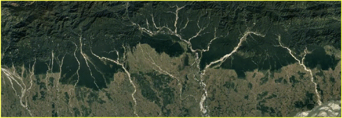
As expected, we found out a massive piece of data that not only could impact our project negatively but now can also make our job easier. In the satellite image (Sonitpur, Assam.) shown above, we consider the darker green portion (Top) to be forest lands and the lighter green portion (Bottom) as urban areas. Although it may not seem justifiable, there is evidence that proves this thesis.
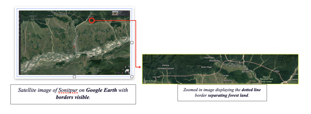
In order to prove this, I used Google Earth, a computer program that renders a 3-Dimensional representation of plant Earth-based primarily on satellite imagery. To the right is the satellite image of Sonitpur district from Google Earth (Latest). The lighter areas in the satellite image will not seem like urban areas at first glance, but when it is zoomed in, you will see civilization.
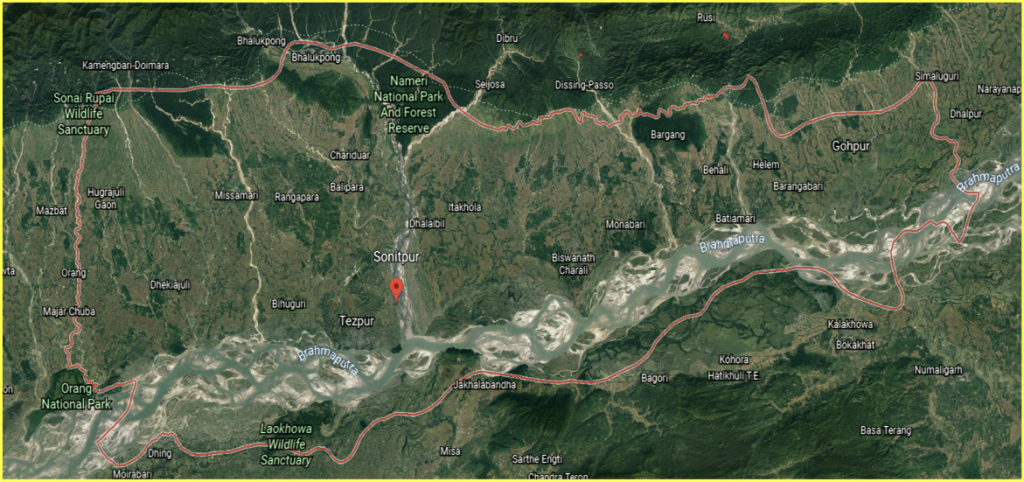
Image 2 (Google Earth’s Image)
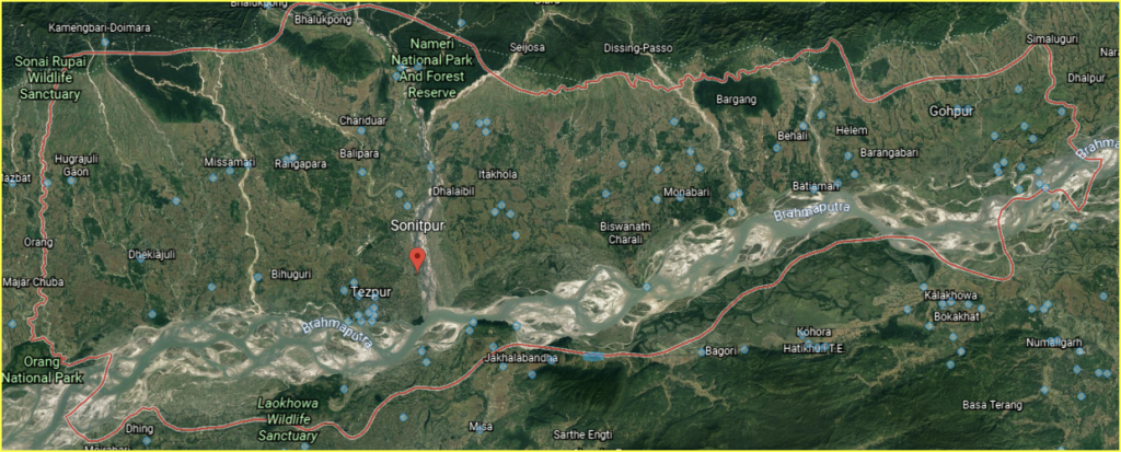
Image 3: Blue Dots Represent Street View.
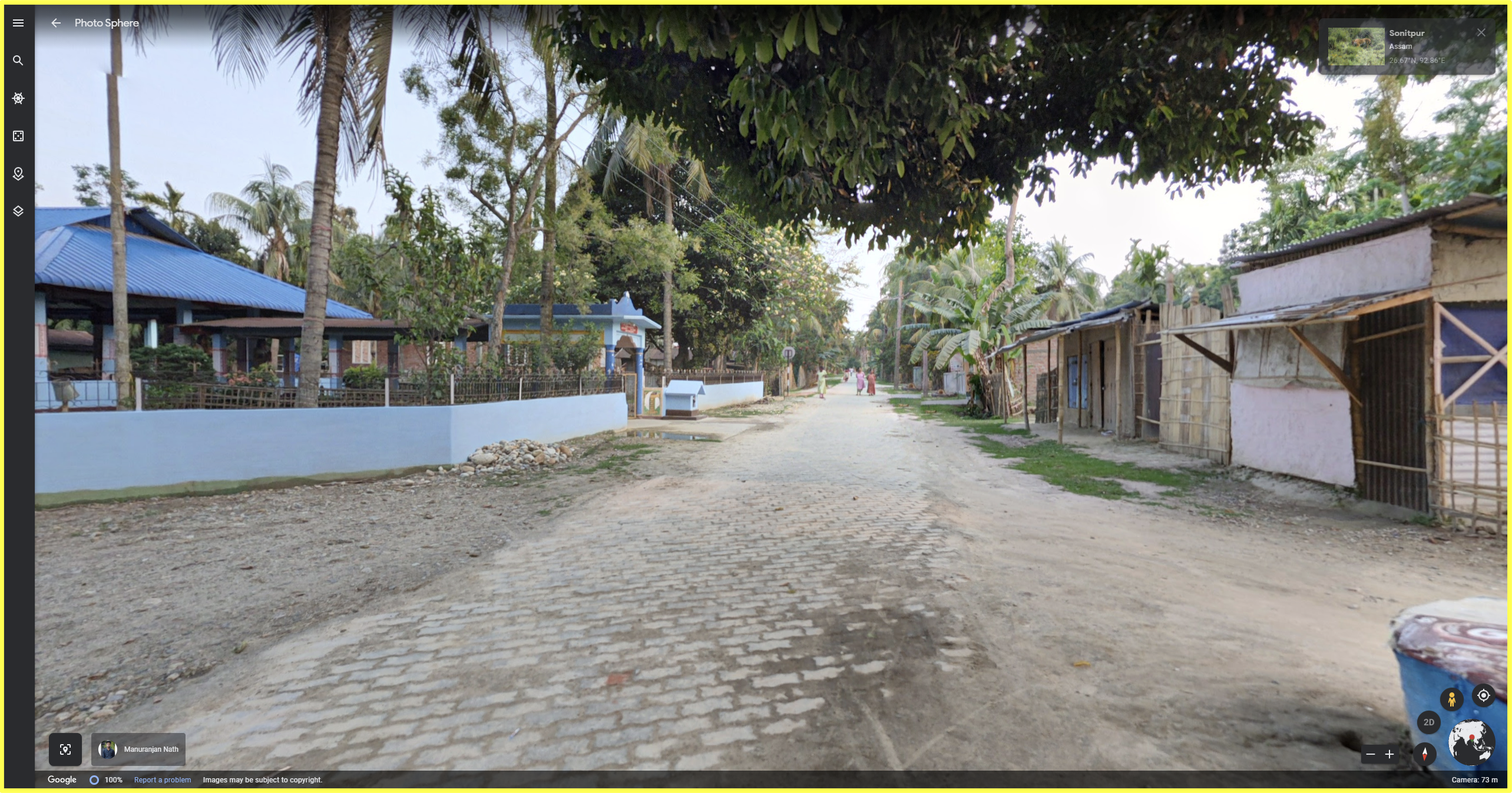
As also visible, most of the blue dots (street view) are present in the light green portion of the satellite image, strengthening our thesis. To even justify this, we clicked on multiple blue dots to check if there was civilization. Below are some of the screenshots of the blue dots, along with the place’s name and its street view.
Street View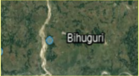
Region’s Name
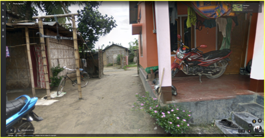
As you can see, one example where we see this thesis playing a considerable role is a place in Sonitpur called ‘Bihuguri’. At first, if you see the satellite image (Above, Image to the left), you cannot identify whether this place is urban or not. However, if you zoom in, it is populated! You might say that this only takes place in this specific region in Sonitpur, but there are many places where this same phenomenon occurs, like in Rangapara.
Street View 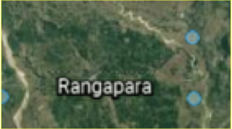
Region’s Name
Coding to Analyze the Satellite Image
Method 1: Digital Segmentation
Now that we have given a closer look at the satellite image to notice any flaws, it is time to use Wolfram Mathematica because of its programmatic and interactive modern industrial-strength image processing capabilities to find out the approximate percentage of how much of the forest in this specific region has faded away.
Firstly, we imported the GIF from the website to Mathematica and downloaded it. Downloading the GIF was a vital task because it would save us a significant amount of time. After all, now, we will not need to import the gif multiple times throughout the notebooks while working on the code. It also helps avoid mistakes.
Then, we worked on removing the timeline present on the bottom of all the gif frames. We used the ‘Image Take’ function to execute this, which removed the bottom of the image. This was an essential step because if we worked on the first frame of the GIF along with the timeline shown below, it would have bought a massive amount of error and uncertainty in the result we will get at the end because of the presence of unnecessary pixels in the bottom of the image.
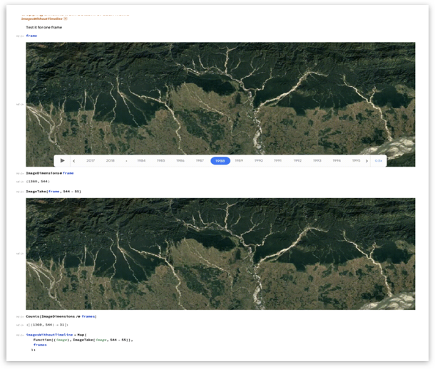
Now that all the unnecessary information in the gif was removed, we started to analyze the first frame of the gif. We used functions like edge detection, binarize, erosion, and sharpening to find approximately what amount of the first frame of the GIF was forest area. Since we were not confident which function would work the best to find this result, we used various combinations of functions and compared their results to be as accurate as possible. The first function we used to analyze the first frame of the GIF was called ‘binarize’. Since the forest area in the first frame is the ‘Dark Green’ area (the Upper Half of the image.), we thought that binarize function would cover all the forest area with black pixels, which would separate the forest from the urban land.
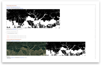
After running the ‘Binarize’ function, we noticed one challenge that we had to overcome. It was the unnecessary small black areas showing up at the bottom of the satellite image. According to our previous research, there is no forest area in those specific regions. They are just urbanized places covered with trees, but Mathematica could not interpret that due to its non-living characteristics. In order to remove this, we used the ‘Erosion’ function. This helped us to remove as many excessive black pixels as possible to get the most accurate results, as shown below.
We then went on to find out the percentage of black pixels (Forest Area) in the above-analyzed satellite image using Wolfram Mathematica’s powerful image processing capabilities. We used all this code (screenshot pasted below) to determine the percentage of black pixels in the analyzed satellite image.
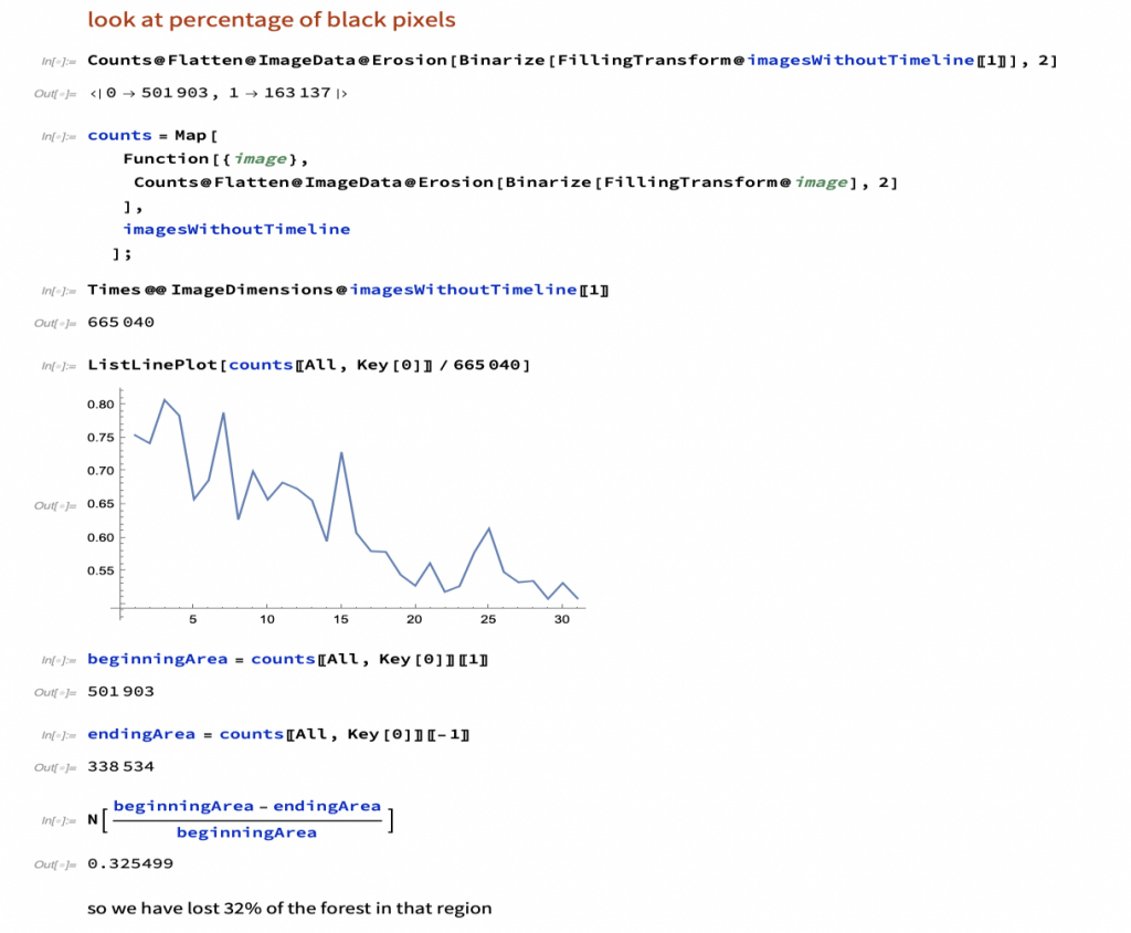
Code used to determine the percentage of the image covered in black pixels.
Through the code mentioned above, we determined that we have lost approximately 32% of the forest area through this method.
Note: The above method of determining the percentage is computational with little to no manual work.
Method 2: Manual Segmentation
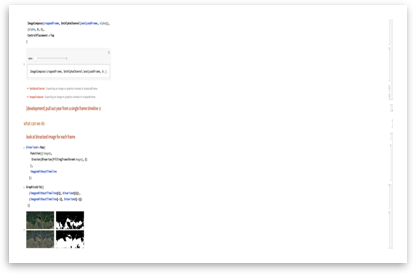
After we had successfully determined the percentage of forest area we lost in Sonitpur over 30 years computationally, we went on to find the exact percentage manually. We are finding the same value again but with a different method to compare both values to check whether they are similar to each other. This will determine the precision of each of the methods to ensure the reliability of our findings.
We will still be using Wolfram Mathematica to analyze the image but, now, instead of using functions like ‘Binarize’ to separate the forest lands from the urban areas, we will be ‘drawing’ the border manually (by hand) over the satellite image to figure out the percentage of forest land lost over the years.
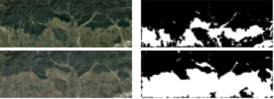
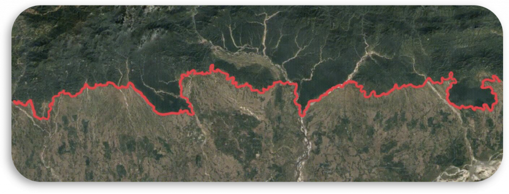
In order to draw the borders, I had to research to find out where the forest separates from the urban area in Sonitpur. In order to determine this, I made use of the website ‘Google Earth’ to find out the political borders. The satellite images below display the border that I will review while drawing a line over the latest satellite image of Sonitpur from the GIF.
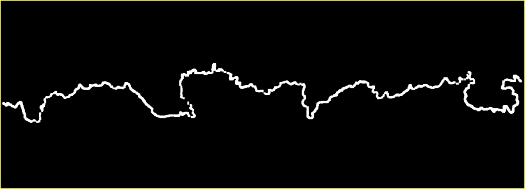
After finding a reference to look at while manually segmenting the satellite image from Google Earth, I drew the border over the satellite image using my Apple Pencil on my iPad. The Apple Pencil allowed me to draw the border more accurately compared to a trackpad or a mouse. Since I needed to use Mathematica for processing the image, I used the color’ Dark Red’ to make it easier for the software to recognize the ‘line’ since it would stand out, thus, making our task more manageable.
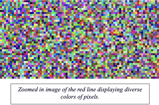
After manually segmenting the lands in the satellite image, we inserted it on Wolfram Mathematica to begin analyzing the image. Our main idea through this method was to separate all the pixels above the red line (Manually drawn border) from the whole satellite image and count their number. After determining the number of pixels above the red line, we can subtract it from the total number of pixels and then divide the difference by the total number of pixels in the satellite image to find the percentage of forest land lost in the area. However, there were some complications that we had to overcome during this process. As we analyzed the image, we found out that the red line that I drew consisted of many combinations of colors (pixels) similar to the image displayed on the right. This will seriously hamper our results and make it difficult for the software to identify the redline since it was not of one consistent color.
To overcome this, we tried using different functions to make the red line as consistent as possible and move on with our project. We used functions like ‘Dilation‘ and ‘Erosion‘ to keep the pixels of the red line consistent. This will keep the result as accurate as possible and make it easier for Mathematica to separate the forest area from the whole satellite image. The image below displays how much we could make the red line consistent. Even though the consistency is imperfect, it will allow us to move forward with our investigation and find an accurate result with minute errors.
Then we used this binarized somewhat consistent red line (image pasted above), used the ‘Mask’ function, placed it over the satellite image, and removed all the urban areas present below the red line border (Bottom half of the image). Due to the inconsistencies in the red line border that I drew manually, some unwanted lines affect our pixel count (Image below). We tried to remove as many unwanted pixels as possible using different Mathematica functions, and the most we could do was remove the major (Thick) lines from the image. Some of the minor lines were still present in the image, as seen below, in the image, but we decided to move on with our investigation because they will not affect our results by a lot.
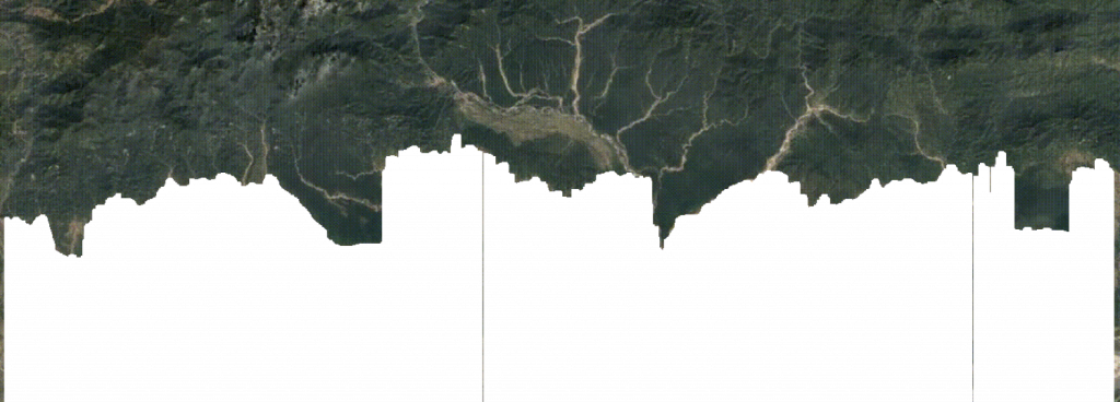
Masked satellite image (without urban area)
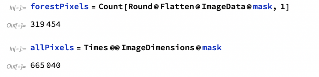
Conclusively, we found out the number of pixels present in the forest area (The image above), which is 319454 pixels and also found out the number of pixels in the whole satellite image, which is 665040 pixels.
We then proceeded to find out the percentage of forest lost by subtracting the total number of pixels by the number of forest pixels and then dividing their difference by the total number of pixels. The result we obtained was 0.519647. This shows that approximately 52% of the forest land has faded away over the years according to this method.
Conclusion
Our Interpretation of the results obtained:
To sum up, both the methods used in this investigation were expected to have similar results, but, as visible above, there is a substantial difference between them (20% difference). Nevertheless, according to our rigorous analysis, Dr. Kyle Keane and I consider the second method more accurate in this case. The second method has the borders drawn manually according to the political borders shown on Google Earth. The first method solely relies on Mathematica cause the software itself is used to determine the border between the forest and the urban areas without any credible external reference like in method 2. Even though method 2 is not perfect due to the imperfections in the pixel count, it can still be a reliable method because of the graph presented to the right. The plot is valid and shows that there is less forest on the left (earlier time) than on the right (most recent time). The main narrative is that we developed an algorithm to automatically calculate the amount of forest in an image, then we used manual segmentation to evaluate how good our algorithm was. The final conclusion is read from the plot that the forest has retreated from around 80% of that image to around 50%.
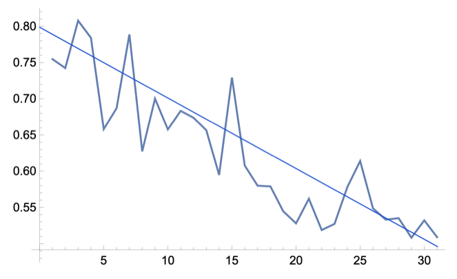
Plot of the trends of the percent of the image that is forest.
Our Message
Considering the results of method 2, we have lost approximately 52% of forest land from 1988 to 2018. This is a massive amount of deforestation that took place in just 33 years. This is not only a significant issue that only pertains to India, but unfortunately, it is a global issue. Suppose humans continue to deforest at such staggering rates. In that case, we might lose all green lands on earth in another 30 years, which will be a colossal issue for all human beings because of problems like global warming and massive deaths of wild animals due to the scarcity of food. Now is when all humans should take action against this and stand together to prevent this from happening. We still have some time left to regenerate ourselves and revive everything we have lost due to our previous doings, even if it was for the best intentions. We humans have to understand that there is no Planet-B which means, we have no Plan-B. In order for our future, we need to start implementing the sustainability factor in our daily lives to keep up economically and not harm the environment as much compared to the past.

Tag- NSS, News and Events, https://news.vidyaacademy.ac.in/wp-content/uploads/2020/11/WhatsApp-Image-2020-11-25-at-12.35.42-PM-855×1024.jpeg.
Bibliography
Keane, Kyle, director. Intro to Mathematica. YouTube, Kyle Keane, 6 Feb. 2018, https://youtu.be/LzKcFYlw_5A. Accessed 26 Sept. 2021.
Bhagat, Raj. “Satellite Imagery Shows India’s Changing Environment.” Geospatial World, Raj Bhagat, 23 July 2019, https://www.geospatialworld.net/blogs/indias-environmental-challenges-in-10-images/ss.
Google Earth, Google, https://earth.google.com/.
Neiburg, Oliver. “Satellite Mapping’s Future: Can Space Tech Halt Deforestation?” Foodnavigator.com, Oliver Neiburg, 2020, https://www.foodnavigator.com/Article/2020/03/10/Satellite-mapping-s-future-Can-space-tech-halt-deforestation.
Davis, Morgan Erickson. “NASA Releases Images of Dramatic Deforestation in Cambodia.” Mongabay Environmental News, Morgan Davis, 2 Mar. 2017, https://news.mongabay.com/2017/01/nasa-releases-images-of-dramatic-cambodia-deforestation/.
“Forest Satellite Images for Sustainable Land Use from Planet.” Planet, 2021, https://www.planet.com/markets/forestry/.
Sriram, Raghav. “Mapping Urban Boundaries onto Satellite Images of Cities.” [WSC21] Mapping Urban Boundaries onto Satellite Images of Cities – Online Technical Discussion Groups-Wolfram Community, Raghav Sriram, 2021, https://community.wolfram.com/groups/-/m/t/2317532.
About the author

Amaad Zaidi
Amaad is currently an 11th grader at the Aga Khan Academy, an International Baccalaureate school based in Hyderabad, India. He is deeply passionate about Science, mainly Applied and Live Sciences and Technology. Amaad has always wanted to discover the different wonders of Science and make Earth a better place through the innovative technology of the 21st Century. He also loves music and plays the acoustic guitar and drums.